Notifications
ALL BUSINESS
COMIDA
DIRECTORIES
ENTERTAINMENT
FINER THINGS
HEALTH
MARKETPLACE
MEMBER's ONLY
MONEY MATTER$
MOTIVATIONAL
NEWS & WEATHER
TECHNOLOGIA
TV NETWORKS
VIDEOS
VOTE USA 2026/2028
INVESTOR RELATIONS
COMING 2026 / 2027
ALL BUSINESS
COMIDA
DIRECTORIES
ENTERTAINMENT
FINER THINGS
HEALTH
MARKETPLACE
MEMBER's ONLY
MONEY MATTER$
MOTIVATIONAL
NEWS & WEATHER
TECHNOLOGIA
TV NETWORKS
VIDEOS
VOTE USA 2026/2028
INVESTOR RELATIONS
COMING 2026 / 2027
About Me
 Latinos Media
 Latinos Media provides all types of news feeds on a daily basis to our Members
Posted by - Latinos Media -
on - November 8, 2023 -
Filed in - Weather -
-
691 Views - 0 Comments - 0 Likes - 0 Reviews


The urban heat island (UHI) was first described by Luke Howard in 1833 for London, England. Urban area air temperatures are almost always warmer than their rural surroundings, especially at night. Thus, the average human experiences warmer temperatures than they would if they lived in wilderness conditions.
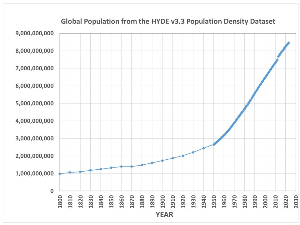
This has nothing to do with global warming, and would occur even if there was no long-term ‘global warming’. In fact, since over 50% of the Earth’s population now lives in urban areas (expected to increase to nearly 70% by 2045), the temperatures humans actually experience would continue to break high temperature records even without climate change. For reference, the following plot shows the increase in global population between 1800 and 2023.

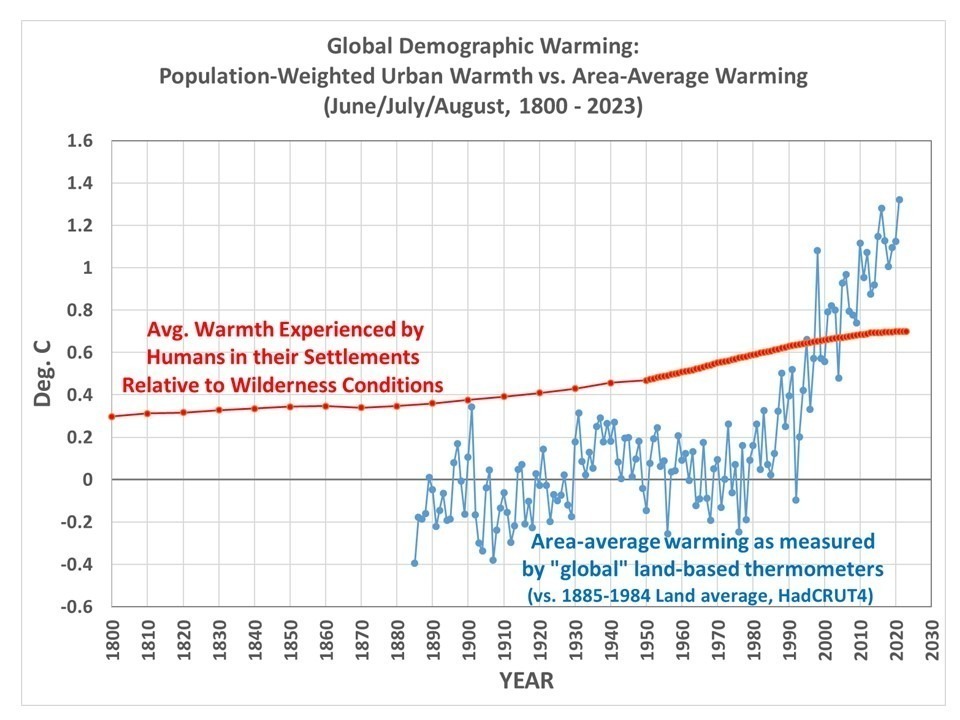
Our new global gridded UHI dataset allows one to compute just how much warmth (vs wilderness conditions) the average person experiences merely because most people live where human settlements cause localized warming. The following plot shows my computed ‘demographic warmth’ (during June, July, and August) experienced by the average human and how it has changed since 1800. For comparison I’ve also plotted the area-average temperature departures from the 1885-1984 average of the land portion of the HadCRUT4 thermometer dataset.

What can one conclude from this plot? At a minimum it shows humans choose to live under warmer conditions just by living in densely populated areas — and increasingly so. I will leave it up to the reader to decide if it shows anything beyond that. Note that this does not include the effect of (for instance) the migration of the U.S. population from colder to warmer latitudes, which would show an additional source of demographic warming. The warming shown by the red curve is only for urban effects relative to wilderness conditions at the same location.
Now, don’t be confused about what this means regarding the UHI impact on the thermometer measurements — that’s a different subject. All this shows is an metric of human-centric experienced warmth, not a thermometer-centric estimate of how much warming from the thermometer network can be attributed to UHI effects. The UHI effect on air temperature is due to a variety of processes associated with human settlements, such as replacement of vegetation with buildings and impervious surfaces and generation of waste heat that change the daily energy budget of those locations. Our UHI dataset simply approximates all of those processes using population density as a proxy, a choice made for us by the fact that it is the best (and possibly only) long-term dataset that exists to analyze the UHI problem.
The post ‘Demographic Warmingâ€\u2122: Humans Increasingly Choose to Live Where Itâ€\u2122s Warmer first appeared on Roy Spencer, PhD..